Jonathan: “You lied first.”
Jack: “No, you lied to me first.”
Jonathan: “Yes, I lied to you first, but you had no knowledge I was lying. So as far as
you knew, you lied to me first.” — Bounty hunter Jack Walsh (Robert De Niro) arguing with white-collar criminal Jonathan Mardukas (Charles Grodin) in the movie Midnight Run
When it comes to audio fidelity, the four standard parameter categories can assess any type of audio gear.
Although published product specs could tell us everything needed to evaluate a device’s transparency, many specs are incomplete, misleading, and sometimes even fraudulent.
This doesn’t mean specs cannot tell us everything needed to determine transparency—we just need all of the data.
However, getting complete specs from audio manufacturers is another matter. Often you’ll see the frequency response given but without a plus/minus dB range. Or a power amp spec will state harmonic distortion at 1 kHz, but not at higher or lower frequencies where the distortion might be much worse. Or an amplifier’s maximum output power is given, but its distortion was spec’d at a much lower level such as 1 watt.
Lately I’ve seen a dumbing down of published gear reviews, even by contributors in pro audio magazines, who, in my opinion, have a responsibility to their readers to aim higher than they often do. For example, it’s common for a review to mention a loudspeaker’s woofer size but not state its low-frequency response, which is, of course, what really matters.
Audio magazine reviews often include impressive-looking graphs that imply science but are lacking when you know what the graphs actually mean. Much irrelevant data is presented, while important specs are omitted. For example, the phase response of a loudspeaker might be shown but not its distortion or off-axis frequency response, which are far more important.
I recall a hi-fi magazine review of a very expensive tube preamplifier so poorly designed that it verged on self-oscillation (a high-pitched squealing sound). The reviewer even acknowledged the defect, which was clearly visible in the accompanying frequency response graph.
Yet he summarized by saying, “Impressive, and very highly recommended.” The misguided loyalty of some audio magazines is a huge problem in my opinion.
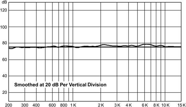
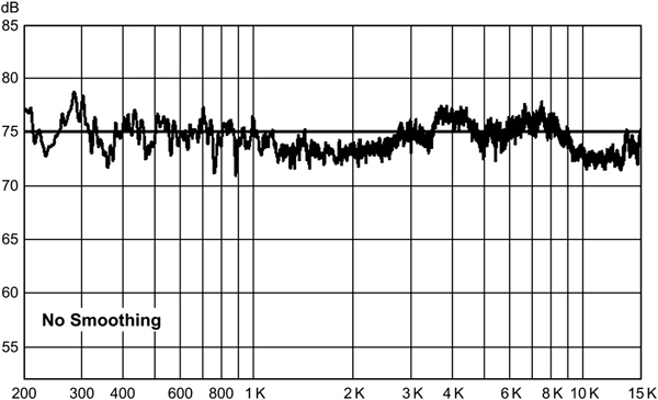
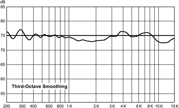
Even when important data are included, they are sometimes graphed at low resolution to hide the true performance. For example, a common technique when displaying frequency response graphs is to apply smoothing, also called averaging. Smoothing reduces the frequency resolution of a graph, and it’s justified in some situations. But for loudspeakers you really do want to know the full extent of the peaks and nulls.
Another trick is to format a graph using large, vertical divisions. So a frequency response line may look reasonably straight, implying a uniform response, yet a closer examination shows that each vertical division represents a substantial dB deviation. The graphs in Figures 1—3 below were all derived from the same data but are presented with different display settings.
For this test I measured the response of a single loudspeaker in a fairly large room with a precision microphone about a foot away. Which version looks more like what loudspeaker makers publish?
